Dark mode is no longer just a trend, it has become a standard feature in modern web design. Many users today prefer either light or dark mode depending on their environment, device settings, or personal comfort.
Adding this feature to your website not only improves user experience, but also makes your project feel more professional, especially if you’re showcasing it in your portfolio.
In this guide, you’ll learn how to implement a clean and performant dark/light mode toggle using Tailwind CSS and a bit of JavaScript.
Why You Should Add Dark Mode?
- Improves user experience
- Gives users control over their preferences
- Enhances your portfolio projects
- Looks modern and polished
- Can be implemented without affecting performance
Step 1 : Configure Tailwind for Dark Mode
After installing Tailwind CSS locally, add this custom variant to your main CSS file :
@custom-variant dark (&:where([data-theme=dark], [data-theme=dark] *));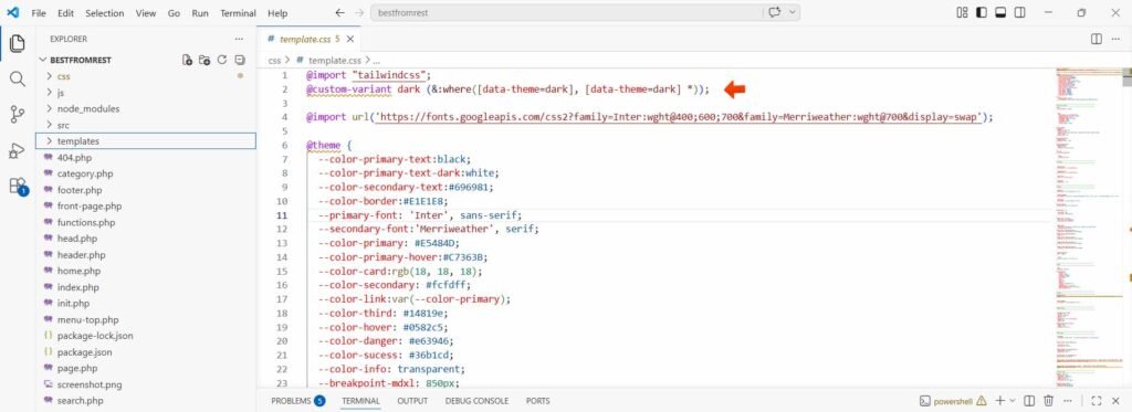
Step 2 : Apply Saved Theme Automatically
We want the website to remember the user’s choice using localStorage.
function applyTheme() {
  const savedTheme = localStorage.getItem('theme') || 'light';
  document.documentElement.setAttribute('data-theme', savedTheme);
}

window.addEventListener('pageshow', (event) => {
  if (event.persisted) {
    applyTheme();
  }
});

document.addEventListener('DOMContentLoaded', applyTheme);
This ensures :
- The theme is applied on first load
- It persists across page navigation
- Works even with browser cache (important detail!)
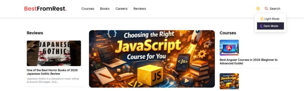
Step 3: Create a Dropdown Toggle for Theme Switching
In this example, instead of using a simple button, we’re creating a dropdown menu that lets users choose between light and dark mode.
This approach improves UX because it :
- Makes the options clearer (instead of just toggling blindly)
- Looks more modern and interactive
- Gives you more flexibility (you can add more themes later if needed)
HTML Structure :
We wrap everything inside a parent container with the ID btn-toggle-mode. This acts as the clickable trigger for the dropdown.
Inside it :
- The icon (sun/moon) shows the current mode
- The dropdown menu contains the theme options
<div class="relative" id="btn-toggle-mode">

  <!-- Icon -->
  <div class="hover:bg-[#FFF8E6] dark:hover:bg-[#1E1C30]
   p-2 duration-300 cursor-pointer rounded-sm block">

    <!-- Light icon -->
    <div class="dark:hidden inline">
      <i class="fas fa-lg fa-sun text-[#FFD473]"></i>
    </div>

    <!-- Dark icon -->
    <div class="dark:inline hidden">
      <i class="fas fa-lg fa-moon text-[#8156F5]"></i>
    </div>

  </div>

  <!-- Dropdown -->
  <div class="dropdown-dark-light hidden absolute w-40
   pt-3 pb-3 px-3 rounded-lg duration-300
   bg-white dark:bg-[hsl(221,14%,9%)]
   border border-[hsl(221,14%,86%)] dark:border-[hsl(221,14%,24%)]">

    <button onclick="setTheme('light')" class="w-full text-left px-4 py-2">
      <i class="fas fa-sun text-[#FFD473]"></i> Light Mode
    </button>

    <button onclick="setTheme('dark')" class="w-full text-left px-4 py-2">
      <i class="fas fa-moon text-[#8156F5]"></i> Dark Mode
    </button>

  </div>
</div>
JavaScript Logic :
Now we handle the dropdown behavior.
const toggleMode = document.querySelector("#btn-toggle-mode");
const dropdown = document.querySelector(".dropdown-dark-light");

toggleMode.addEventListener("click", (e) => {
  if (!dropdown.contains(e.target)) {
    dropdown.classList.toggle("hidden");
  }
});
How It Works :
- When the user clicks on the container (#btn-toggle-mode), we toggle the dropdown visibility.
- The condition !dropdown.contains(e.target) ensures : 1. Clicking the icon opens/closes the dropdown, 2. Clicking inside the dropdown (on buttons) doesn’t instantly re-toggle it
Pro Improvement (Recommended)
To make it feel more polished, you can also close the dropdown when clicking outside :
document.addEventListener("click", (e) => {
  if (!toggleMode.contains(e.target)) {
    dropdown.classList.add("hidden");
  }
});
Step 4 : Save and Apply the Selected Theme
Now that the user can open the dropdown and choose a mode, we need to actually apply and store the selection.
function setTheme(mode) {
  document.documentElement.setAttribute('data-theme', mode);
  localStorage.setItem('theme', mode);
}
What This Does :
- Updates the data-theme attribute on the element
- Saves the user’s preference in localStorage
- Ensures the choice is remembered on future visits
Step 5 : Set a Default Theme
Don’t forget to define a default theme directly in your HTML :
<html data-theme="light">Step 6 : Use Dark Mode in Tailwind
Now comes the easiest (and most satisfying) part.
With your setup, you can use Tailwind’s dark: modifier to style elements differently depending on the theme :
<div class="border-gray-200 dark:border-gray-700
            bg-gray-100 hover:bg-gray-200
            dark:bg-gray-500 dark:hover:bg-gray-600">
</div>
Tip :
Think of dark: as an override. You write your normal styles first, then adjust only what changes in dark mode.
Step 7 : Handling Special Cases (Images & Assets)
Sometimes CSS alone isn’t enough, However, in some cases like logos, you can handle everything cleanly using Tailwind without any JavaScript.
For example, if you have two versions of your logo (one for light mode and one for dark mode), you can simply toggle their visibility using Tailwind’s dark: utility :
<a class="logo" href="/">

  <!-- Light logo -->
  <img
    class="block dark:hidden w-full max-w-40 sm:max-w-70"
    src="light-logo.png"
    alt="Logo">

  <!-- Dark logo -->
  <img
    class="hidden dark:block w-full max-w-40 sm:max-w-70"
    src="dark-logo.png"
    alt="Logo dark mode">

</a>
Why This Works :
- dark:hidden hides the light logo in dark mode
- dark:block shows the dark logo only when dark mode is active
- No JavaScript is required
- Keeps your implementation simple and performant
Tip
Try to rely on CSS whenever possible. Use JavaScript only when you truly need dynamic behavior. This keeps your code cleaner and improves performance.
Common Mistakes to Avoid
This section is very important for SEO (Google loves this kind of content) :
- ❌ Using data-theme=”white” → always use light
- ❌ Overcomplicating logic with too much JavaScript
- ❌ Forgetting to load the saved theme on page load
- ❌ Not handling cached pages (pageshow event which you did ✔️)
Final Thoughts
Dark mode is a small feature with a big impact. It improves usability, gives users more control, and makes your projects feel modern and complete.
The key is to keep your implementation :
- Simple
- Performant
- Easy to maintain
With just Tailwind CSS and a few lines of JavaScript, you now have a fully functional and scalable theme system.